Accessible app: large text in TrailTrackr (Android & iOS)
TrailTrackr for Android has recently been in a closed test on Google Play. A small group of people uses the app in daily life and tells me where it goes wrong. Reports have already come in about recordings without a place name and about recordings with the location turned off, and every report made the app better.
Sometimes the best feedback is not a review but a single message from a tester: “With me you get a test thrown in, namely whether the app is accessible for people with poor eyesight.” With a face-palm smiley behind it. A joke, but also a fair point.
According to the same tester, apps often go wrong on two things: font size and contrast. I used TrailTrackr myself with the default text size, so I had not noticed.
Why large text is a real test
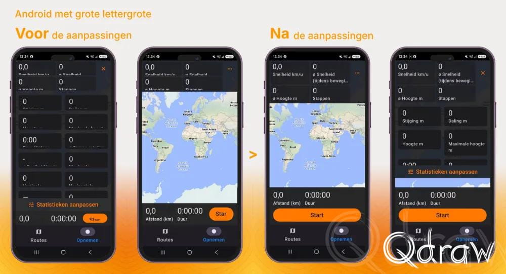
People with poor eyesight make the text on their phone larger. Android has font size (font_scale) for that, iOS and Apple Watch have Dynamic Type. At the largest accessibility size text becomes more than twice as big. A screen that looks fine suddenly stops working:
- text that is cut off or runs over other text;
- buttons that disappear off screen, including the button you need to start or stop a recording;
- rows with several values next to each other where only one letter per line is left;
- screens with fixed heights that do not grow along.
An outdoor app has to handle this especially well. You use it in the sun, on the move, often with a quick glance.
What is different now
I went through all screens, dialogs and sheets at the largest text size, in Dutch because it has the longest texts. The rule is now: no fixed point sizes or fixed heights around text. Concretely:
- Sizes that grow along. Sizes scale with the text setting and heights are a minimum, not a fixed number. Where the layout needs room, there is an upper limit so the screen does not fall apart.
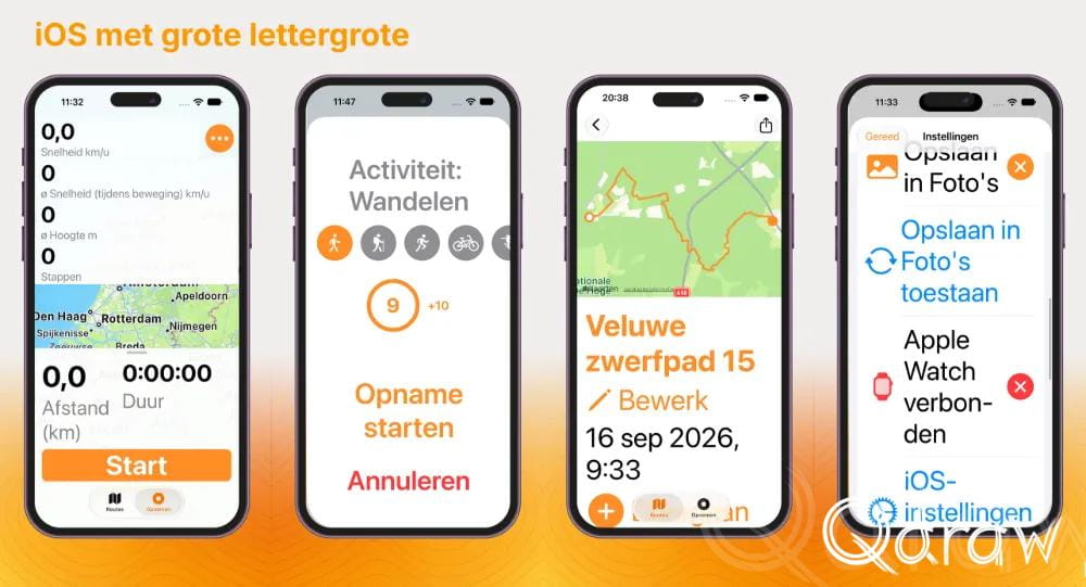
- Long content scrolls. Sheets with a fixed height, the permission screens and the list for customizing statistics now scroll.
- Rows that do not fit go below each other. On iPhone the start button moves below distance and duration, the statistic tiles are one per row and track lists and totals stack. Settings put sliders and buttons under their title. On Android the recording screen does the same as soon as the text is larger than about 130%.
- Charts read along. The label next to the axes grows along, up to a limit, so elevation and speed charts stay readable.
- Apple Watch. The readings and control screens scroll and scale and the four buttons are stacked.
- The main action stays reachable. Whatever the text does, Start and Stop stay in view.
The colors of the permissions under Settings are also clearer: the Location row names exactly which setting you chose (“Always”, “While using the app”, “Never”) and is colored green, orange or red. So you do not have to rely on color alone to know whether it is right.
On iPhone too
While going through the screens it turned out the iPhone version had similar problems. Nobody had reported that in the past year. That is exactly the problem with accessibility: people who cannot read an app usually do not write an email, they switch to another app. So what you do not hear is not the same as what is not there.
How I keep an eye on it
This is not a one-off cleanup. There is now a fixed rule for every screen I add or change: first look at it at the largest text size, only then is it done. That way it does not come back with the next update.
What I learn from it
As a maker you do not easily see such problems yourself. I know where everything is and I use the app with the default settings. Without this remark I probably would not have noticed for a long time.
Thanks to the tester for thinking along.